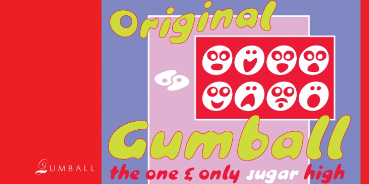
Gumball was designed by Patrick Griffin, Richard Weber and published by Canada Type. Gumball contains 2 styles and family package options.
We didn’t make this font because we thought the letters were pretty. We didn’t make this font to look cool. In fact we’re ashamed we made this font, and we wish we never had to make it. We hate this font because it tells us that a part of our past was stolen.
The only reason we made this font is to let you know this disturbing piece of information: The 1990s were a sham. Remember Raygun? Carson, Brody, Deck, Plazm, all the cool Japanese designs? Experimental this, organic that, blur here, slap-together there? They may as well never have existed.
This is the original Gumball, straight from the forgotten days of 1958. Yes, you read right. These letters were designed for the then-mighty Bauer foundry by an unknown named Richard Weber, in NINETEEN FIFTY EIGHT! The original font’s name was Papageno, presumably referencing the name of the bird catcher in Mozart’s The Magic Flute.
It was our designer’s duty to inform you of your stolen past. So we made Gumball. It is still hard for us to swallow: These letters are the typographical parallel of Khrushschev, Nixon, deGaulle, Batista, Kerouac, Capote, Levi-Strauss, Peter Gunn, Bridge on the River Kwai, Project Mercury, and three-cent stamps.
Gumball is a bubble gum font. It’s round. It’s sickly sweet. It spreads like a viscous stain of blood or honey. It’s good for things like packaging comfort food, and parodying 1990s design. Maybe if you’re very imaginative you can come up with a really good use for it and make us all feel better about a lost decade. We urge you to try.
We’re feeling quite depressed about the whole thing. We’re sorry we were the ones who had to inform you of this loss.
Now we return to our scheduled font construction.

