Gridiot was designed by Peter Bain and published by Peter Bain. Gridiot contains 2 styles and family package options.
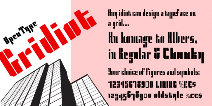
Gridiot is a constructed, semi-serif, two-weight stencil family that expands an approach taken by Josef Albers.
Intended for display or headline setting, it features chamfered or bevel-cut corners, used instead of curves. The individual letter components sometimes vary in depth, avoiding a strictly modular approach, while the widths are kept consistent. The lining figures provide a standard set of numbers, and the oldstyle figures align with the lowercase, encouraging lowercase-only setting. Currency and other useful numerical symbols are provided in both versions. The zero is intentionally lighter, following early Renaissance types; there are filled versions as stylistic alternates. While horizontal scaling distorts the relationship between verticals and horizontals in a typeface, since every chamfer in Gridiot is at 45°, changing the horizontal scaling of the type will affect all diagonals equally.
When used at a large size, or for a just few words, Gridiot can be very tightly spaced.
Remember, any idiot can design a typeface on a grid: Gridiot.