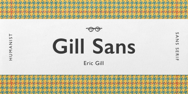
Gill Sans was designed by Eric Gill and published by Monotype. Gill Sans contains 21 styles and family package options. The font is currently #47 in Best Sellers.
Gill Sans is a humanistic sans serif family that, while is considered by many to be quintessentially British in tone and concept, has been used in virtually every country and in nearly every application imaginable. Gill Sans has reached this level of near-ubiquity for one simple-and very good-reason: it is an exceptionally distinctive design with a potential range of use that is almost limitless.
This toolkit family includes a wide range of styles including the standards such as Light-which is open and elegant-and a Regular that, with its flat-bottomed d, flat-topped p and q and triangular-topped t, has a more compact and muscular appearance. Its Bold styles tend to echo the softer, more open style of the light while the extra bold and ultra bold have their own vivid personalities, but each of them would make for an eye-catching headline. Take into account the family’s many weights, including condensed and extra condensed designs, and extended language support and you have yourself a tool you’ll be thrilled to return to, time and again.
Gill Sans was designed by Eric Gill: a versatile, brilliant, and prolifically successful designer of the early part of the last century. One of the main reasons for the enduring success of his namesake design is that it is based on Roman character shapes and proportions, making it unlike virtually any other sans serif out there. Gill also worked his own warmth and humanity into his design, resulting in a typeface in which each weight retains a distinct personality of its own.
Pair with serif fonts like Gill’s own Joanna; or more modern offerings like Frutiger® Serif, Malabar, Syntax® Serif, FF Scala®, or DIN Next Slab.

