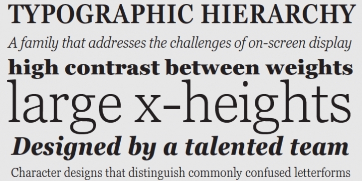
Georgia Pro was designed by Matthew Carter, Steve Matteson and published by Ascender. Georgia Pro contains 20 styles and family package options.
Originally designed in 1996 by Matthew Carter and hand-tuned for the screen by Tom Rickner. The Georgia typeface family received a major update in 2010 by Monotype, The Font Bureau and Matthew Carter.
Georgia is the serif companion to the sans serif screen font, Verdana. It was designed specifically to address the challenges of on-screen display with elegant yet sturdy and open forms. If you must have one serif face for reading on a computer, then you’ve found the best one right here. The original Georgia family included four fonts: regular, italic, bold and bold italic. The new and expanded Georgia Pro family contains 20 fonts in total. The Georgia Pro and Georgia Pro Condensed families each contain 10 fonts: Light, Regular, Semibold, Bold and Black (each with matching italic styles). Georgia Pro includes a variety of advanced typographic features including true small capitals, ligatures, fractions, old style figures, lining tabular figures and lining proportional figures. An OpenType-savvy application is required to access these typographic features.

