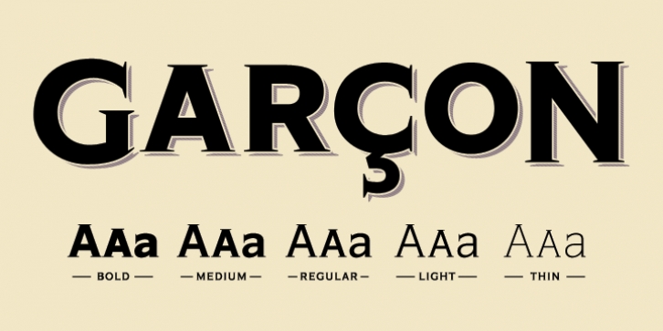
Garcon Grotesque was published by Thomas Jockin. Garcon Grotesque contains 5 styles and family package options.
From pastiche to sophisticationâ€, ‬Garçon Grotesque improves on a classic for today’s designerâ€. ‬Designed in a multitude of weightsâ€, ‬extended latin character setâ€, ‬small capitals and a working lowercaseâ€, ‬Garçon is built for any situation that calls for sophisticationâ€, ‬elegance and cultureâ€.‬
Built in five weightsâ€, ‬Garçon Grotesque allows for great flexibilityâ€. ‬Use the Bold weight for beefy headlinesâ€. ‬Use the the medium and regular weights for subheads and decksâ€. ‬Use the Light and Thin weights for a softerâ€, ‬more delicate toneâ€. ‬All weights have the same size spursâ€, ‬so you can mix and matchâ€! ‬
Right out of the boxâ€, ‬Garçon Grotesque offers full language support to most eastern european speaking territoriesâ€. ‬Most foundries release these accent characters as a†‘‬pro‒ ‬release at an additional feeâ€. ‬Just because you speak Turkish or Croatianâ€, ‬shouldn’t mean you have to pay more than a designer who speaks Englishâ€. ‬Please see the Specimen PDF for more information about languages supportedâ€. ‬
Accessible as an OpenType Featureâ€, ‬Garçon Grotesque offers alternate forms of the uppercase†‘‬J‒, ‬and the lowercase†‘‬a‒ ‬and†‘‬g‒. ‬Use Stylistic Set 01†‬for the alternate form capital Jâ€. ‬Use Stylistic Set 02†‬for the alternate form of the lowercase aâ€. ‬Use Stylistic Set 03†‬for the alternate form of the lowercase gâ€. ‬
Also accessible as an OpenType Featureâ€, ‬Garçon Grotesque offers tabular figures in all five weightsâ€. ‬Perfect for menusâ€, ‬tabular figures allow for number listings to align easily and without shifting if a different font weight is selected for emphasisâ€. ‬

