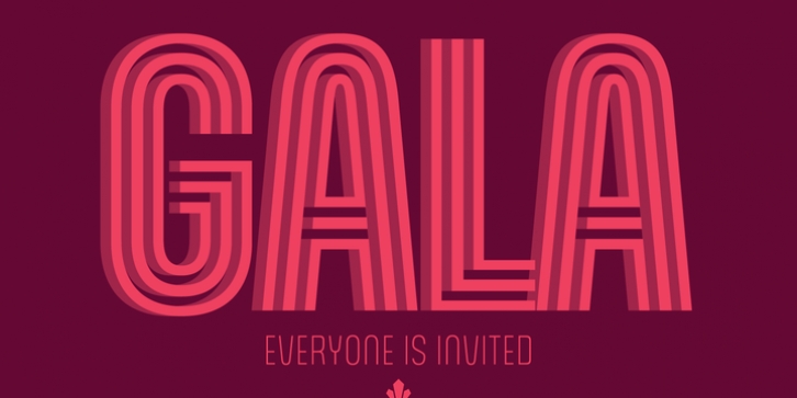
Gala was designed by Patrick Griffin, Giulio Da Milano and published by Canada Type. Gala contains 15 styles and family package options.
Gala is a digitization, correction, and major expansion of a typeface called Neon, designed by Giulio da Milano and published by the Nebiolo foundry in 1935. Neon came in two weights, along with a shadow version called Neon Ombra, and a “modules” version that consisted of a series of lines and cusps that could be used to build variations on the shapes and widths of da Milano’s original forms. It was an instant international success upon its release. One of the very first modular faces with a clear-cut, minimal unicase construct, Neon is considered a direct predecessor of Microgramma/Eurostile, and has inspired countless designs across three type technologies. Pretty much every “techno” font now in existence has some Neon in it.
Canada Type’s Gala series was originally published in 2005 and consisted of three fonts – straight revivals of the original Nebiolo set. Over the years since then, it became quite popular, and underwent many additions through custom commissions and special projects. A dozen years after the original release, there were enough additional elements to prompt a revisit of the set. Gala was meticulously redrawn, polished greatly expanded to include four weights in three widths, as well as 2-line, 3-line and Shadow fonts. Each of its 15 fonts comes with quite a few alternates and a solid 420-glyph character set for comprehensive Latin language support. So now Gala has become even more of an essential designer accessory. Its clean and airy shapes make for fresh and timeless settings, and its many widths and weights offer plenty of versatility on design grids.

