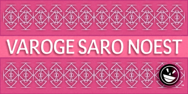
FTY Varoge Saro Noest was designed by Michael Adkins and published by The Fontry. FTY Varoge Saro Noest contains 1 style.
VAROGE SARO NOEST arrives on your computer with OpenType replacement features standard, along with extended language support for Central European, Greek, Cyrillic and Extended Cyrillic. We’ve even included some nice character options for our German-speaking customers with the uppercase Eszett and a number of alternatives to the standard lowercase eszett. Also included is the new Turkish Lira.
VAROGE SARO NOEST is a font with a very funny name. Sometimes it can be a funny font. Or a font that is fun. It looks kinda casual, but also a little bit handwritten–freeform and freehand. Or a form of block lettering with a rough edge. Not too rough. Just enough to break up the visual rigidity. But this is not a face in distress. It’s mostly at ease in its surroundings. If it’s in text mode, it handles the job comfortably. In headline mode it does well too. It’s quite flexible and looking for a home. Give this font a home. See if you can figure out what to use it for. See if you see what we saw when we made it. We saw a font that’s cool and elegant with a bit of a tantrum driving the node count. We also found it’s impossible to look away from it. Anyone can see that. That’s why you’re here. That’s why you’re reading this. And VAROGE will do you a favor if you let it. Revisit your typographic beliefs and head over to the one persistent constant in life: your font list. Is VAROGE SARO NOEST on it? If it were to set up headquarters there, you might discover something ideal. That’s the favor I was promising.

