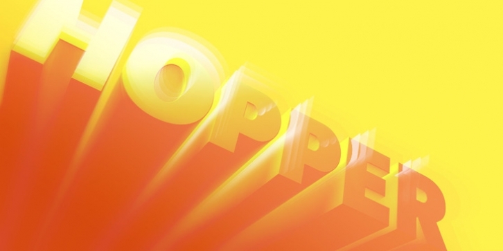
FR Hopper is the biggest release of Faberfonts Foundry since its opening. The project started as a quest for cool and neutral thin sans capital forms and proportions more than a year ago. Since then, lots of things have changed and have been added, and the project has grown into a project as complex and prolonged as nothing else before here in the studio of Faberfonts.
FR Hopper is a sans based on geometric forms still having a friendly personality. It is intended for mid-length texts, captions, titles and almost any other occasional use – posters, flyers and even for web sites.
FR Hopper comes in 7 weights, 12 styles with 836 glyphs – that means 10,032 glyphs ready to use for your projects – and many advanced OT-features such as small caps, discretionary ligatures, alternate characters, fractions, arrows, ornaments and more – in all styles.
It supports Extended Latin-A and Latin-B character sets and more than 100 languages. Italics are based on carefully slanted roman versions but come with many cursive characters drawn from the ground up. It provides enough of a difference to the italics to stand out successfully from the romans – or attract by their own charm. All the styles are hand-kerned carefully. As two of the styles – FR Hopper 430 and 431 – come as free fonts, you can download and test these before deciding to buy any other styles.

