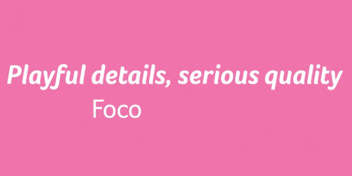
Foco was designed by Fabio Haag and published by Dalton Maag. Foco contains 8 styles and family package options.
The playfulness of the Foco font family’s design details belie its serious quality. Foco can be equally well employed in the toughest of corporate identities, or to entice in advertisements. While the playful details shine through in titling or display sizes, the font family’s primary task, functionality, is clearly demonstrated at text sizes. The distinctive and open character shapes ensure the highest legibility. Foco is best applied where high visibility and recognition are demanded, yet with careful use it can support quiet communication with a subtle and sympathetic voice.
The Foco Standard Edition includes the Latin Extended A character set. Please see the Corporate Edition of Foco for an extended character set including Latin, Greek and Cyrillic scripts.

