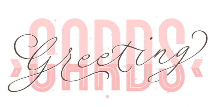
Fluire was designed by Maximiliano Sproviero and published by Lián Types. Fluire contains 5 styles and family package options.
MAS AMOR POR FAVOR (1)
(more love, please)
Fluire means -to flow- in Italian and that’s what this font is all about.
The story began when a friend of mine asked for a tattoo with the word -Fluir- (to flow in Spanish). She didn’t want a tattoo full of swashes and swirls, like I’m used to doing, but something more fluent, soft and minimal. My very first attempts were more related to copperplate calligraphy but I wasn’t even close: I discovered that I needed to forget a little bit about the classic contrast and speed of the engrosser’s nib and started playing with a tiny flat metal nib. Letters started to flow, and I immediately thought of turning them into a font.
Inspired by the tattoo I created and by other tattoos I saw, I started the journey of what would be a very fun process. The result is a very cute, almost monoline font with a wide range of uses.
USES
If not used for a tattoo (my first ‘target’), the font delivers amazing results in combination with Fluire Caps: These two need each other, they go together, they talk.
I designed Fluire Caps Down and Fluire Caps Up so it’s easier to manage their colors. Also there’s Fluire Caps Down Lines, which has a decorative thin line to add yet another dimension.
Use the fonts in magazines, book covers, posters, greeting cards, weddings, lettered walls, storefronts!
TIPS
Since the font is Open-Type programmed, I strongly recommend using it in applications that support that feature. Also, the font looks way better when -contextual alternates- are activated, but it’s your choice 🙂
Try Fluire, and keep flowing.
NOTES
(1) The phrase alludes to maybe the most tattooed phrase in Latin America.

