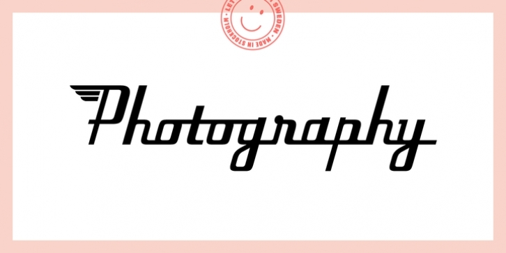
In September, 2006, a friend showed me a very interesting old logo, Pan Air Corporation. I instantly fell in love with it and decided to make a typeface inspired by the hand drawn letters. While the logo had a very large caps height, I had to take a more traditional approach and make them lower. I worked intensely for a couple of days, trying to make each letter capture the concept of the logo and then continued polishing the details and started developing the font files.
Today, with OpenType technology, the typeface is very flexible. Each of the three weights (light, regular and bold) has over 30 automatic special ligatures, a bunch of stylistic alternate letters, swash letters with and without wings and an extended language support.
There are totally 748 glyphs in each weight of the Flieger Pro family, including ligatures, alternate letters, swash letters, old style figures, lining figures, accented characters and the “wing caps†blessed with wings by Lotta Bruhn.

