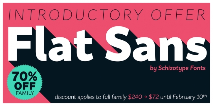
The future of design is Flat, and for Flat Design, you need a flat typeface. Sure, you could use any number of sans-serif fonts, but this type family is actually called Flat Sans, so it’s a no-brainer really!
Flat Sans is a grotesque with humanist leanings, clean and contemporary in appearance. Its large range of weights are designed with versatility in mind; you can set highly legible copy or use loud and proud at display sizes.
Stylistic sets make key decisions yours. Double storey a and g are default in both Roman and Italic styles, but you can switch to single storey versions if you prefer, and there are two alternate forms of y available too. Stylistic variants of uppercase I and lowercase l designed to be less ambiguous are also included in all styles. An alternate Q completes the arsenal.
Designed for demanding typography, supporting most Latin-based languages, Flat Sans is equipped with true small caps for all weights, an array of numeral styles (proportional- and tabular- lining and oldstyle figures, small cap figures, superscripts and subscripts/scientific inferiors), automatic fractions, a set of useful arrows, case sensitive forms, superior lowercase letters, and a range of currency symbols including recent additions: Turkish Lira, Indian Rupee and Russian Ruble.
Flat Sans also features a handful of useful Greek characters for scientific writing.

