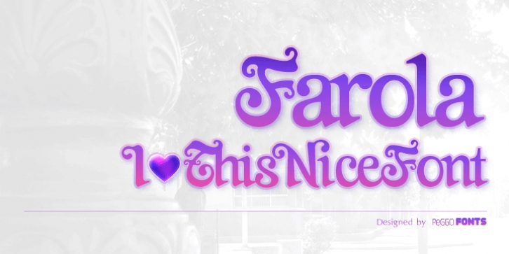
Farola was published by PeGGO Fonts. Farola contains 3 styles and family package options.
Farola is a curly and romantic victorian display font, inspired specially on the ancient decorative forged iron lamps called ‘farolas’ used on street and parks of the 1800’s.
At first it was created as a lettering logotype for the collective called ‘Tipografistica’, a kind of experimental type and graphic design studio founded by college friends, the font was temporary identified as the same name as the collective, at same time, it was the first complete alphabet project commercially developed for PeGGO Fonts foundry, then it changed to current font name ‘farola’.
The Farola process includes several technical cares, specially considering the visual balance weight, proportion ratio, contrast shapes, soft curves, outer and inner empty spaces also called ‘whites’.
The main characteristics of ‘Farola‘ are curly shapes and its stronger drop spot finials. Due to concept design thoughts was ‘lettering logotype’. The most common pattern of this was the closer junctions between each logotype letters. To create the effect of unit, the serif and several finial shapes and also kerning adjustments keep those ideas on mind. The result was the unique kind of serif created specifically for this font.
The most recommended usage of ‘Farola‘ are logotypes & lettering, but also packaging, posters, fashion young girl’s magazines headlines, videogames letterheads, valentines graphics, cover books, and many other similar ones.

