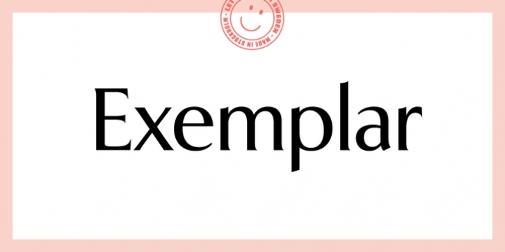
Having just finished a little bit of calligraphic studies, I was twenty years old when I made the first sketches of Exemplar in 1994. Inspired by the beauty and perfection of several typefaces and the art of calligraphy, I got started on my first attempts to create a new typeface. My goal was to create a typeface that was traditional yet unconventional, a balanced combination that felt both old and new. Respectful of the art of typography, I turned to history for inspiration and placed equal attention towards taking a step into the future. Two years later, the designs for both regular and italic versions were complete (that was at least what I thought at that time).
A first attempt to make Exemplar a fully functional font took place in 1996. But years passed and a general lack of time needed forced the project into a deep sleep for about ten years. In the first days of 2006, Exemplar experienced its revival when Psy/Ops signed a distribution deal for the typeface. Now, the real work began (I had to learn FontLab properly) and all glyphs were redrawn and improved. Diacritics were build for central European languages and small caps, different numerals and alternate letters were added.
Finally, the typeface family was expanded to four weights with corresponding italics.

