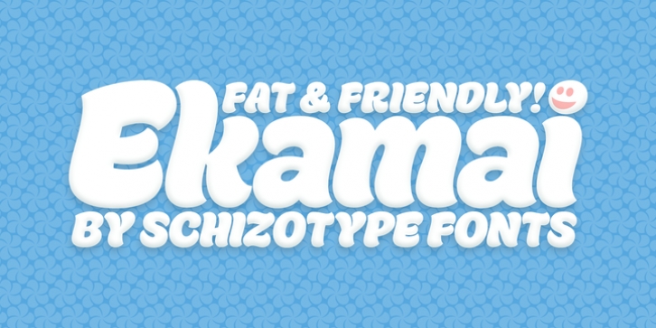
Ekamai was designed by Dave Rowland and published by Schizotype. Ekamai contains 1 style.
This is Ekamai, named after the district of Bangkok I now have the pleasure of calling home. It is based on Quinella, and was supposed to be a quick and easy reworking of that font into a ‘tight-not-touching’ (rather than overlapping) version. As is often the case with quick and easy things, it turned out to be neither, and the vast majority of glyphs needed to be completely overhauled to fit the new system.
This face is deliciously plump face, with lovingly rendered curves and just the right amount of cuteness; perfect for food packaging (of the sweeter variety probably!), logos, magazine headlines and the like. It performs admirably in all caps settings. The numerals are expressive hybrid figures (somewhere between lining and oldstyle). The overall feel is friendly and soft, without being overtly saccharine.
Ekamai is equipped with subtle contextual alternates (which I’d recommend leaving on) to help with the tight fit, a handful of discretionary ligatures if that’s your thing, and a case feature for all caps settings. The stylistic alternates and stylistic set 1 features simply change the # glyph to an attractive numero. Automatic fractions are included along with wide-ranging language support.

