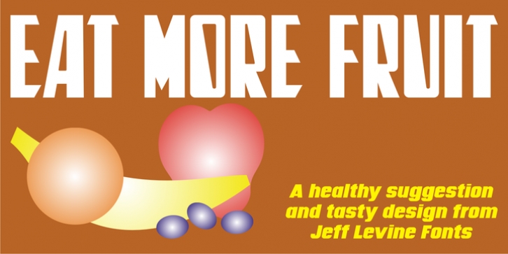
Eat More Fruit JNL was designed by Jeff Levine and published by Jeff Levine. Eat More Fruit JNL contains 1 style.
Eat More Fruit JNL is an odd name for a typeface, but then again the lettering style of the font is just as unusual.
Named for a 1940s-era poster espousing ‘Put more pep in your step… eat more fruit’, the lettering (although Art Deco in nature) also evokes images of 1960s and 1970s hippie-era concert posters.

