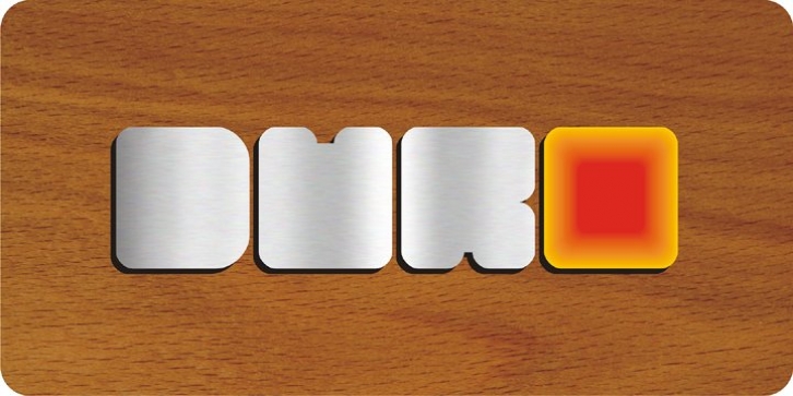
Duro was designed by Joey Maul and published by Joey Maul. Duro contains 4 styles and family package options.
Duro was inspired by the shape of today’s common electronic devices such as mp3 players and cell phones. The smooth shapes work nicely with branding. Duro features bold rounded-corner rectangular shapes.
The Outline version aligns perfectly with the Regular version.
Duro is best used as a headline font with UPPERCASE. It is great for logotypes, shorter words, kids’ stuff, acronyms or initials with upper and lowercase, and perfect for filling with photos, textures, etc.

