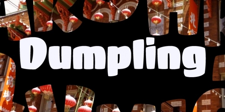
To get right to the point, Dumpling was drawn, digitized and mastered by an 18-year old over a semester-long Senior Concentration in Graphic Design at the South Carolina Governor’s School for the Arts. Seriously, think about that! What were you doing when you were a senior in high school? I watched this unfold as her teacher, guiding where I needed to, encouraging when necessary, but ultimately putting her through a ridiculously tedious, painful and compressed process. She did not falter, she did not complain, she worked.
In her own words (taken from an excerpt of her concentration paper), “In the middle of all this, I went to Charlotte, NC and saw and opera, the set designer was Jun Kaneko, [and afterwards] went to the Mint where we attended his talk (subsequently meeting him) and then perused a gallery of his work. His large ceramic forms made me realize how connected type is to sculpture. The medium may be different, but the ideas of negative space and forms interacting with each other and the view to convey a message are essentially the same.
Architecture too, is surprisingly connected to type. I find myself gravitating towards the word, ‘entasis’ as a way of describing my letterforms, though they have no reference to the Parthenon or Classicism. In type you need balance, continuity, a little unexpectedness, and a good amount of math.”
What can you say? She listened to me 🙂
In full disclosure, Mary Catherine, after completing her digitization, final tweaks, etc. in FontLab, turned the font over to me for OpenType coding and testing; though, I look forward to teaching her that next.

