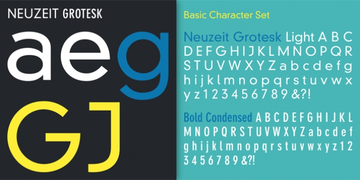
DIN Neuzeit Grotesk was designed by Wilhelm Pischner and published by Linotype. DIN Neuzeit Grotesk contains 6 styles and family package options.
The German Standards Committee suggested the ‘light Neuzeit-Grotesk’ font in 1970 for use in official signage, traffic directional systems, etc. The typeface had been designed by Wilhelm Pischner and appeared with the font foundry D. Stempel in 1928. The font Neuzeit Grotesk was once the standard in the print industry, as a timeless typeface with no real distinguishing features. Like other typefaces of the 1920s, DIN Neuzeit Grotesk reflects the philosophy of the times, ‘Form is Function.’

