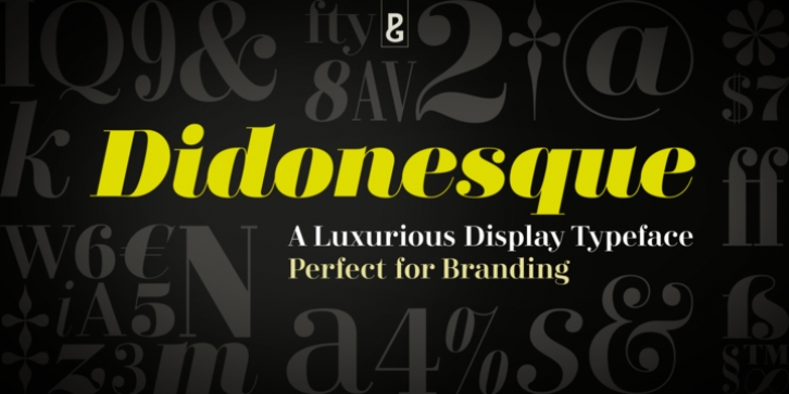
Didonesque was designed by Paulo Goode and published by Paulo Goode. Didonesque contains 16 styles and family package options.
Say hello to Didonesque – inspired by classic Didone typefaces that are synonymous with luxury brands, it is a highly versatile and elegantly stylish font family. It is inherently a display typeface and therefore ideal for headlines, logotype, branding and short runs of text.
See more examples at this font’s microsite – http://didonesque.com
Distinguishing features include a higher x-height with shorter ascenders and descenders than traditional Didone typefaces, there are slight curvatures within the /v/w/y/ characters helping to give Didonesque a distinctive style. Also included are small caps and petite caps with full European diacritics, you can mix and match the petite caps with regular lowercase glyphs to create interesting unicase-style typography.
Key features:
• 4 weights in Roman and Italic styles
• Poster & Display styles in roman and italic
• 4 weights in Condensed style
• Small Caps, Petite Caps, Alternates, Ligatures and Contextual Alternates
• Full European character set
• 750 glyphs per font.

