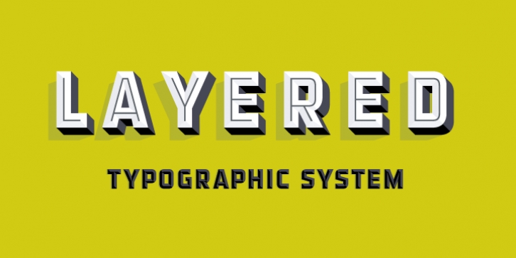
Detroit was designed by Alex Sheldon and published by Match & Kerosene. Detroit contains 12 styles and family package options.
Detroit is a 12 font system that can be layered in different ways to create endless classic titling effects used commonly in signage by skilled sign painters and sign makers. Unlike other display fonts, Detroit is not a “one trick pony” that produces the same effect over and over. Detroit‘s layer combinations give you complete control in producing styles like inline, outline, collegiate, drop shadow, 3D, convex, and bevel. It’s sturdy gothic base can be used alone and/or allows you to plot out titles and adjust leading, kerning, and alternates. Each font contains the same metrics, so when your title is set, copy and paste-in-place to create layers of different weights/styles to build out your desired effect. Some fonts are clearly dependent on layer stacks to create desired effects, which is why certain fonts in this family are not available for individual sale.
Detroit works great in any graphics application that allows you to utilize layers. Sign shops take note: this font system allows you to create rich sign lettering effects for vinyl cut signs without editing the font itself.
Each font comes with a free companion PDF for those who would rather “handset” these layers. PDF’s will contain the fonts you purchase in an outlined vector stack. Advantages to using a handset method include: 1. Adjust kerning, leading, size, and spelling by dragging stacked layers opposed to making changes in every font layer. 2. Visualizing letter styles in a full stack. 3. Utilizing global color. 4. Vector curves. 5. Better aliasing control. 6. Font management & installation of font software is not required.

