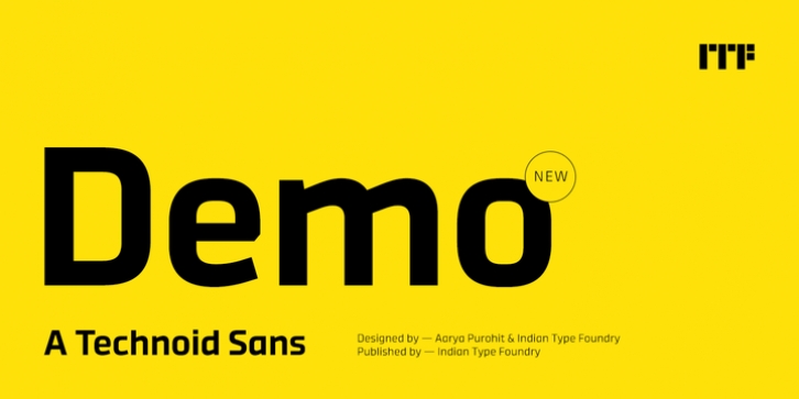
Demo was designed by Aarya Purohit and published by Indian Type Foundry. Demo contains 10 styles and family package options.
Demo is a flat-sided, technoid-style sans serif family. It has ten fonts on offer; that’s five different weights, each with a companion italic. The italics are really obliques, differentiating themselves from texts set with the upright fonts by their slant. However, rather than calling the italic fonts ‘slanted’ versions of Demo‘s upright fonts, we should rather say that Demo‘s upright fonts are ‘straightened-up italics’. Much of the letter construction in the Demo typeface is actually italic, meaning that it is inspired by handwriting. And this despite its being a sans serif with an almost futuristic appearance. The ‘a’ and ‘g’ in Demo are both single-storey, but the combination of curves and corners in these two letters is right out of a 16th-century Italian chancery. The other notable feature of Demo is the strong mono-linearity present in all ten of the fonts. Demo‘s letters do not include any visible stroke contrast: Demo‘s lowercase has a very tall x-height, and the capital letters are compact (the lowercase’s ascender strokes rise above the caps somewhat). Demo does not need to be restricted to use in display sizes only; its lighter weights may be used to set shorter passages of body copy, too. Demo was designed by Aarya Purohit and the Indian Type Foundry (ITF).

