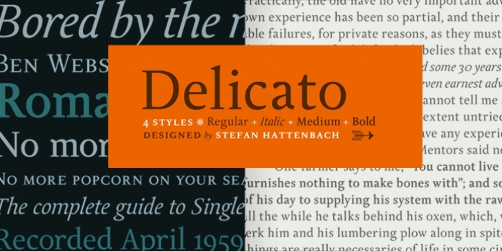
“After spending my early years experimenting mostly with display faces, my focus now is to make functional text fonts, incorporating both traditional and modern aspects.
Delicato is, in many aspects, built in a traditional way. Still, some modern details have been implemented which classic designs sometimes lack. The prime goal was to make a strong text font for books and longer texts in general. This fact does not exclude the possibilites for use elsewhere.
Throughout history existing designs have often been the source of inspiration for newer ones. Delicato is no exception and looking closely, similarities can be found in the lowercase of Jeremy Tankard’s Enigma and the stems of Petr van Blokland’s Proforma. My goal is to respect these sources and turn my own creation into something new with a unique and personal touch.
Most text faces carry a basic set of weights like regular, italic, bold and small caps. I wanted to expand that a little bit further and added a medium, alternates and a set of ornaments to make the family complete and versatile.”
– Stefan Hattenbach –

