dearJoe 4 was designed by Jeroen van der Ham and published by JOEBOB graphics. dearJoe 4 contains 5 styles and family package options.
DearJoe 4 was made around 2005 as the fourth in a list of fonts that I
revisit every once in a while in an attempt to create something that
comes as close as possible to my own handwriting at that time. As my
handwriting evolves, so does the font and the later versions all include
new features such as new special signs and Cyrillic and Greek glyph sets.
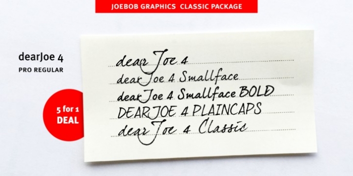
DearJoe 4 comes as a set of 5 fonts: The regular version, which has a
bit jagged edges just like one would see when looking at ballpoint
writing up close, a Plaincaps version, a Smallface version (also in
Bold) and the first (classic) render of the font which is the least
doctored and has the roughest edges.
These 5 fonts come together as a Classic package.