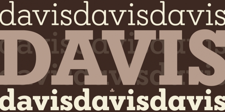
Davis was designed by Patrick Griffin and published by Canada Type. Davis contains 8 styles and family package options.
Over the past couple of decades, the many applications that joined print as media requiring design solutions have combined to necessitate a visual evolution that favours controlled optical geometry and careful counter-space consideration over ornamental features traditionally associated with print design. This is now true in corporate, advertising and interface design, and is even spilling over into editorial layouts. Such focus on clarity and precision in modern design environments have brought to light the many issues that riddle classic print faces, and increased the call for new solutions. The reinvigorated type design market responded to the demand, sometimes with original takes that build on the classics, and sometimes with merely subtle differences from the old aesthetics.
The Davis family, though in its own right an excellent modern typeface that works quite well in traditional environments, was conceived and produced to be one half of a set of counterparts – a slab and a sans – that satisfy the multiple layers of corporate and advertising projects, from identity and editorial to the many levels of product branding.
Davis and Davis Sans come in four weights with corresponding true italics, totalling eight fonts per family. Each font includes over 400 glyphs, with extended Latin language support, stylistic alternates, and class-based kerning.
This project was motivated in part by our desire to send a couple of very promising design students to a postgraduate MA program in typeface design, the costs of which continue to be increasingly prohibitive for the vast majority of design graduates. With that in mind, we have made Davis and Davis Sans families available at token pricing for design professionals and students alike, and the entirety of Canada Type’s revenues from these faces will be donated to those graduates seeking their higher education.

