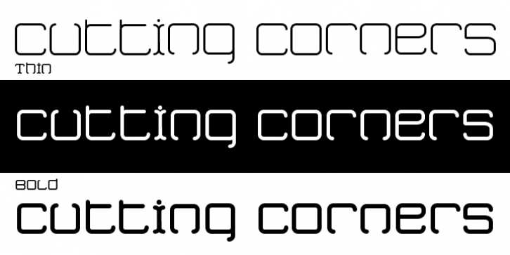
Cutting Corners was designed by Randy Harris and published by Just My Type. Cutting Corners contains 3 styles and family package options.
Cutting Corners is all about letters made of squares that also suggest circles. That’s it.
This is one of several fonts I’ve created based upon a strictly geometric form; in this case, a round-cornered square.
The width is equal to height (except for i, I and most punctuation).
Usage recommendations: logos, samplers.

