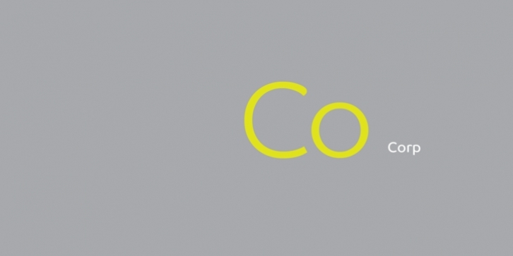
Soft and round are the words that best describe the Co font family. Its underlying geometry structures the font design and allows it to have an even rhythm. The harmony between organic and geometric shapes makes Co Headline uniquely appealing for display and titling where special expression is required. Co Text carries even more organic and fluid design elements than its headline cousin. To assist with legibility and functionality, features have been tightened and its basic proportions are less geometric in their appearance.
The Co font family was created in collaboration with North Design. The Co Corporate font includes full Latin, Greek and Cyrillic character sets. Co Standard Edition and Co Arabic are also available separately.

