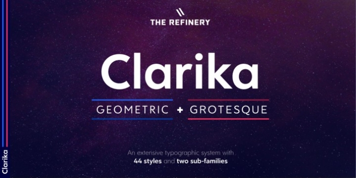
Clarika was designed by Brandon Knap and published by The Refinery. Clarika contains 44 styles and family package options.
Clarika is a geometric sans serif type system consisting of eleven weights and two style variants; Clarika Geometric and Clarika Grotesque. As the name would imply, Clarika boasts incredible legibility at both body and display sizes.
Clarika Geometric, the backbone of the system, is defined by minimalism, geometry, and purity of form while Clarika Grotesque is refined by elegance, traditional form, and grotesque qualities. This dynamic duo provides robust versatility leveraging the calculated precision of Geometric or the classic detailing of Grotesque. Unique notches and angled terminals invite negative space into counters allowing letterforms to become more legible and identifiable as well as gracefully support incredibly heavy weight options. Clarika is both a nod to the past and a step towards the future.
Clarika is equipped for professional typography with OpenType features including lining, tabular, and oldstyle figures, fractions, ordinals, superscripts, subscripts, and more. Character sets have been extended to support over 200 Latin-based languages covering the Eastern, Central, and Western European regions.
Be sure to check out the microsite to get the full Clarika experience.

