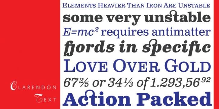
Clarendon Text was designed by Patrick Griffin and published by Canada Type. Clarendon Text contains 20 styles and family package options.
Clarendon Text is a contemporary remake of the truly classic slab serif typeface with a distinctively clear and legible visibility. It is a widely usable text type suited equally well to advertising, books, publications, and a wide range of corporate literature where large amounts of reading matter call for distinction and style without sacrificing readability.
The rich, full-bodied style of Clarendon Text takes its primary inspiration from the classic 1953 Hoffmann/Eidenbenz polishing of the mid-nineteenth century English slab serifs originally conceptualized by extraordinary craftsmen like Vincent Figgins and Robert Besley. The italic styles of Clarendon Text take their cue from Aldo Novarese’s 1955 Egizio typeface, which was the very first to attempt a true italic companion to the Clarendon roman.
Clarendon Text slightly departs from the original roman and bold in semantic details that make it contemporary and more easily read. The shapes of the letters like a, g, q, and t were revised to be more in line with an immersive body copy face. The original a, g, q and t are available as alternates, for display uses, or those designers who like to make use of the traditional Clarendon. The ascender serifs were also slightly revised for a better immersive reading fit. Clarendon Text was tested thoroughly for readability in sizes between 8 and 12 pt. This is demonstrated in the 4-language print test PDF available here in the font gallery. Display uses are also clear and attractive, especially with the bold weights.
Clarendon Text is also the very first version of the Clarendon classic that takes advantage of current type technologies to bring you small caps, five different styles of figures, fractions, and support for over 40 Latin-based languages. Each of Clarendon Text Pro’s 4 fonts contains over 580 characters.

