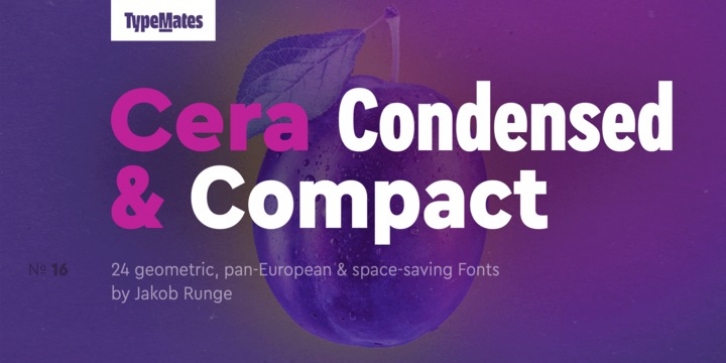
Cera Condensed & Compact Pro was designed by Jakob Runge and published by TypeMates. Cera Condensed & Compact Pro contains 24 styles and family package options.
The pan-European Cera Collection is driven by pure geometry and contains the bestselling Cera, its stenciled counterpart Cera Stencil, the hand-crafted display Cera Brush and the soft Cera Round.
Developed for the narrow reading environments of mobile devices, user interfaces and text columns, Cera Condensed and Compact take the clarity and geometry of Cera Pro to new places.
Narrow but not obviously condensed, Cera Compact is made for efficiency in body text. With regularly proportioned spacing it has the flexibility for text and headlines, taking up less space without making text less readable.
Super tight Cera Condensed is for when you need a geometric sans that can work in a narrow space, large or small; compact information leaflet or compressed headline.
Condensed or Compact, a broad spectrum of six weights, thin to black, each with matching italics makes these fonts ready for any typographical requirement and reliable typographic tools for interfaces and corporate design. And it gets even better: for best on-screen performance the TrueType files for the web and desktop fonts are improved with manual hinting.
The extended, pan-European Cera Condensed and Compact support around 150 languages in the Latin, Cyrillic and Greek scripts, and its non-Latin components were developed with native consultants. With over 980 glyphs per style, Cera Condensed and Compact care about localised letterforms and have the OpenType features to match.

