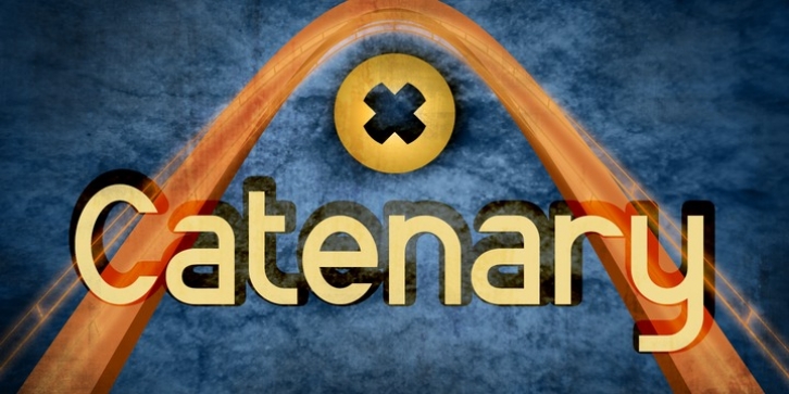
Catenary was designed by C.C. Marshall and published by Active Depth. Catenary contains 9 styles and family package options.
The Catenary typeface was designed with the goal of creating an extremely-readable sans-serif font that could weather the future. Inspired by the beauty of the catenary curve, it’s a blend of the transitional and the geometric that allows it to be readable while keeping its forms precise and consistent.
Every character in its set is unique, leaving no confusion between similar letter forms. Sixes and nines can be distinguished even when they’re upside down or sideways. The number one, the lowercase-L, and the uppercase-I can never be confused with one another, even without context. Throw b, d, g, p, and q into a jumble and the challenge of distinguishing the characters can easily be overcome.
The Catenary family consists of eight fonts, six of which, the standard light/italic, regular/italic, and bold/italic, work as both excellent text fonts and exceptional display fonts. The two bonus fonts, a stencil and a guerrilla grunge style, make for great additional display font choices. The Catenary family is extremely versatile and ready for your toughest design work.

