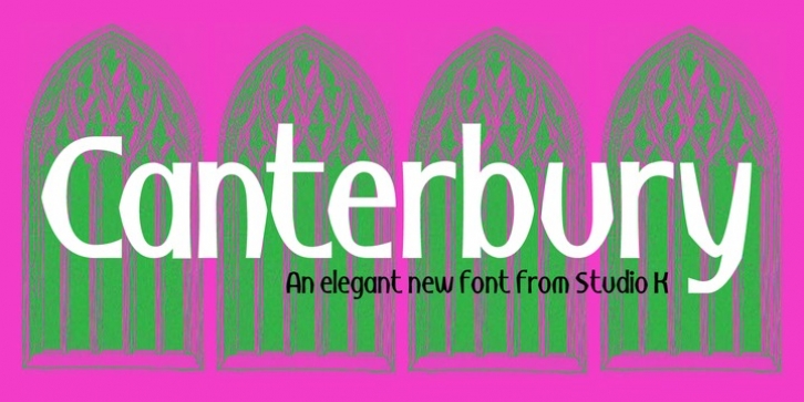
Canterbury was designed by Keith Tricker and published by Studio K. Canterbury contains 2 styles and family package options.
Canterbury is named after the English cathedral city in the county of Kent, chiefly because its sculptural qualities are reminiscent of ecclesiastical architecture. It’s a monumental font in the sense that it is well suited to plaques, certificates and other formal inscriptions. It’s also suitable for any application that strives for a sense of elegance and dignity.

