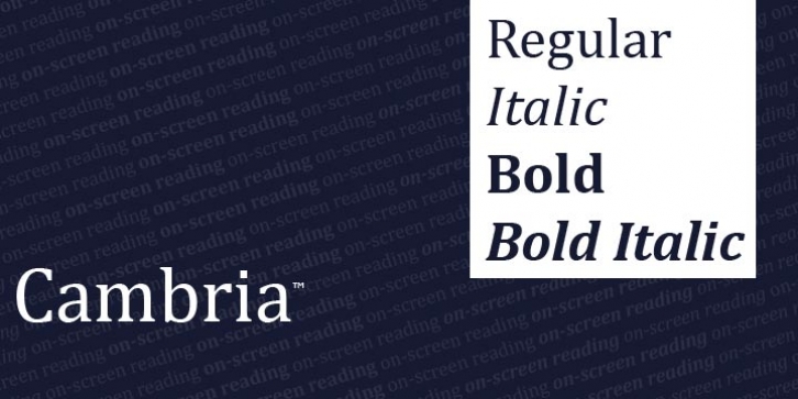
Cambria was designed by Jelle Bosma, Robin Nicholas and published by Ascender. Cambria contains 4 styles and family package options.
Cambria has been designed for on-screen reading and to look good when printed at small sizes. It has very even spacing and proportions. Diagonal and vertical hairlines and serifs are relatively strong, while horizontal serifs are small and intend to emphasize stroke endings rather than stand out themselves. This principle is most noticeable in the italics where the lowercase characters are subdued in style to be at their best as elements of word-images.
When Cambria is used for captions at sizes over 20 point, the inter-character spacing should be slightly reduced for best results. The design isn’t just intended for business documents: The regular weight has been extended with a large set of math and science symbols. The Greek and Cyrillic has been designed under close supervision of an international team of experts, who aimed to set a historical new standard in multi-script type design.
Cambria was tuned for ClearType rendering environment and is included with Windows Vista and Office 2007.

