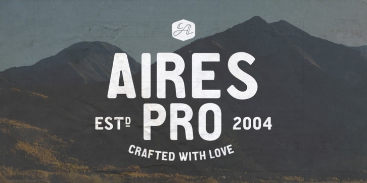
CA Aires Pro was designed by Stefan Claudius and published by Cape-Arcona. CA Aires Pro contains 2 styles and family package options.
This font was inspired by a postcard from the 30s.
On the one side near the stamp were the words ‘BUENOS AIRES’. It looked so simple yet strange, that we started to make a font of it. It turned out to become Cape Arcona’s most popular freefont and we were even sent Spanish versions of the font.
After a lot of requests for a full character set we started to draw the lower cases. They keep the simple but quirky style that makes the upper cases so interesting and versatile.
To round it out we added an italic version to give a bit more artistic freedom.

