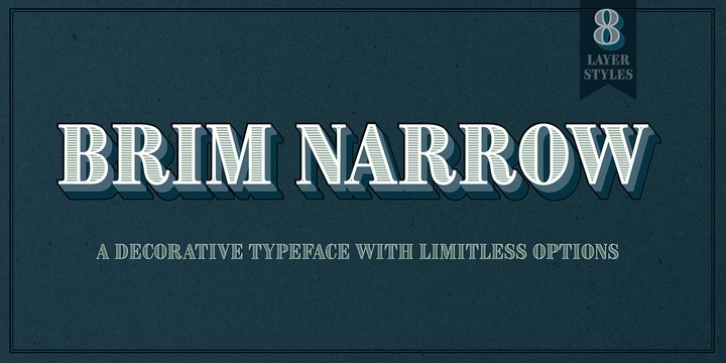
Brim Narrow was designed by Jamie Clarke and published by Jamie Clarke Type. Brim Narrow contains 8 styles and family package options.
Brim is inspired by antique woodtype and chromatic type from the 1800s. Its various styles stack together creating a variety of decorative combinations. Each layer can be assigned its own colour, resulting in a rich assortment of eye-catching results.
The font began as a handful of letters created for a logotype. It became clear that it would make an excellent display typeface, so it was expanded to include all uppercase letters, numbers, European accents and more. Warm and tactile, Brim produces punchy headlines and decorative titles. Perfect for posters, packaging and logotypes.
The name Brim accurately describes the expanded outer edge designed to produce its distinctive outlines. This overlapping structure couldn’t function correctly in wood or metal type; however for digital typography this system produces a more efficient solution for colour type, both in design and smaller file size, important for web typography.
Many thanks to Dave Foster, Toshi Omagari, & Terrance Weinzierl, who generously gave their time to guide the design of this typeface.
For a flattened version, see Brim Combined.
Download the specimen for tips on using Brim Narrow.

