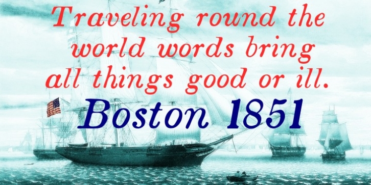
Boston 1851 was designed by Shane Brandes and published by Proportional Lime. Boston 1851 contains 13 styles and family package options.
Boston 1851 is based on a stereotype used by Wier and White, Printers of Boston, that was created by the New England Stereoype Foundry under the auspices of Hobart and Robbins, also of Boston.
This particular font has a nice strength combined with a fullness that lends to good legibility especially in smaller sizes. The italic version has a wonderful movement to it and also is extremely legible in fine print, perhaps, therefore not the best choice for fine print you do not want read.

