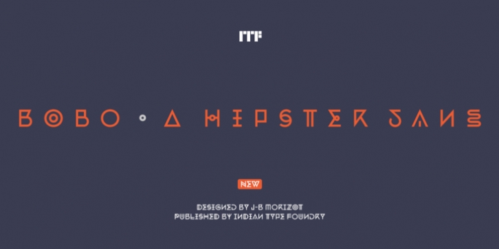
Bobo was designed by Jean-Baptiste Morizot and published by Indian Type Foundry. Bobo contains 1 style.
Bobo is a great hipster sans. It is caps-only, but it contains a lot of variety. Don’t miss its Stylistic Set feature, which contains a completely new set of capital letters, their accented variants, and an even more dynamic range of numerals (0–9). Some of Bobo‘s letterforms have strokes that have been doubled; others are missing typical elements. Repetition is a key feature of the design. Some are unicase-looking, while others are compressed. Other letterforms are mirrored. Bobo even included several “jewelled” letterforms, with circles in their centers – reminiscent of medieval illuminated manuscript lettering and 18th-century ornamented typefaces. The typeface’s .notdef is a skull – a particularly wicked-looking one, too! The name Bobo stands for “bourgeois Bohemian.”

