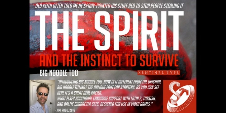
Big Noodle Too was designed by James Arboghast and published by Sentinel Type. Big Noodle Too contains 2 styles and family package options.
The success of the original Big Noodle Titling fonts is based partly on the squared letter body design being ideal for use in video games. Game maker Blizzard Entertainment comissioned me to make a custom version with extended language coverage including Latin 1, Latin 2, Turkish, Baltic and Cyrillic.
Big Noodle Too oblique style is a fast slanter at 15 degrees.
A generic set of capitals built on the gothic even width principle, built from squared forms Big Noodle Too delivers excellent clarity in any medium. Its key features are its utility and generic, unremarkable appearance. Patterned after countless squared grotesks and linears, Big Noodle Too is industrial in essence with a contemporary topography. One weight fits all.
In OpenType & TrueType flavors.

