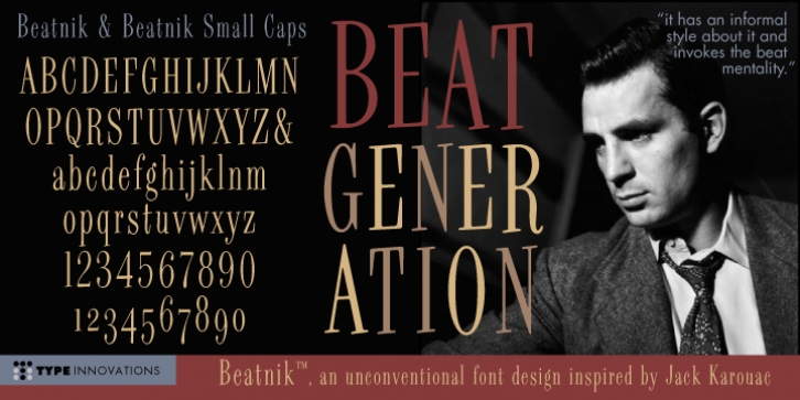
Beatnik was designed by Alex Kaczun and published by Type Innovations. Beatnik contains 2 styles and family package options.
I was working at Bozell Worldwide, an advertising agency, on their yearly promotional pitch. An art director was looking for a condensed informal headline treatment to be used on one of the new ad campaigns. I took several different font designs and started to condense and scale the proportions in the hopes of finding several good solutions. They finally settled on a version of Times Roman, scaled horizontally to about 50 percent proportions. I liked the look so much that I later went back to the drawing board and refined the concept by adding slanted serifs and a varying alignment on all the letter forms giving the typeface a very casual and informal appearance. At about that time, I was reading a book by Jack Kerouac, and was so inspired by his writings on the ‘beat generation’ that I decided to name the font ‘Beatnik‘. Afterwards, I added a set of true small capitals and old style figures. I’m currently working on additional weights and variations to expand this ‘hip’ new font series. Groovin’ baby.

