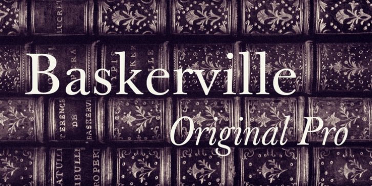
Baskerville Original Pro was published by Storm. Baskerville Original Pro contains 12 styles and family package options.
Until recently the story of this typeface ended with mediocre digital versions, which did not get at the root of its inspiration. Our pursuit of this paramount body typeface of the 20th century began in Nové Hrady Castle, the place where a part of the depository of old prints of the National Museum Library is kept, in the summer of 1999. Thanks to the understanding of the librarian Petr MaÅ¡ek we were allowed to study and photograph four rare volumes from Baskerville’s printing office, dating from about 1760. We selected as the most successful models for the digitization of this typeface its Roman and italics in the size of about today’s 14 points, which Baskerville used for the printing, among other things, of his folio Bible in 1763 and Vergil’s works in Latin in 1757. These were large-size, stately prints on paper smoothed out by hot copper calender rollers. When composing the pages, Baskerville emphasized the importance of the blank space, just as the effect of the majestic austerity of the setting, which became an inspiration for Neo-classical typographers. He strove to remove everything which obstructs legibility, working without ornaments and rules, neatly, and with large margins. He proceeded along these lines also when designing his new typeface. His punchcutter John Handy was given the task to make the typeface different from the then fashionable Caslon, which was a surprise for a certain part of typophiles of the period. Baskerville perhaps anticipated certain elements known from Bodoni and Didot, which is why nowadays everybody calls it a “transitory” phenomenon. A detailed evaluation of Baskerville’s heritage, however, remains a task for historians. Our analytical transcription enhances rather the artistic and visual qualities of his typeface.
When digitizing the typeface, we did not have at our disposal a complete alphabet – partly because Baskerville did not solve some of the characters (some of them did not even exist at the time), partly because we were loath to go to Cambridge where the greater part of the original punches is deposited. But there was no need to do this. For inherent in every fragment of any typeface is the principle, according to which it is possible, with a little bit of natural feeling, to complete the set of characters. An analytical transcription is also to remove any potential shortcomings of the source of inspiration and must not take over mechanically all details of the design. Even creators of genius, however, make mistakes sometimes and, therefore, in spite of the fact that we officially speak about “a transcription”, what was involved in the case of all complementary designs was a fairly fundamental reworking. Our aim was not so much to be reverently faithful to the original, as to preserve the spirit of the typeface and to breathe new life into it. Baskerville is a typeface with the character of a gentleman, a typeface of sober elegance and clear design. Its nature is remote from dramatic contrasts, as we know them from the Continental typography of the Late Baroque period. A project of a typeface family which includes twenty designs cannot rely on a single pair of tired eyes; that is why we are again grateful to Otakar Karlas for his valuable advice, especially when putting the finishing touches to the typeface. It was upon his recommendation that, among other things, the anatomy of the basic (original) design was reinforced, the rhythm of the italics in text sizes was made more tranquil, the balance of the “&” sign form and the colour of the small caps were improved. The result is an absolutely ordinary and inconspicuous typeface – a worker in the service of literature. The softness of its design predetermines it for every type of fiction and poetry, while its rational construction makes it useful also for scientific publications. Having worked on Baskerville’s typeface for more than a year, when we see it now, it feels like meeting an old friend.

