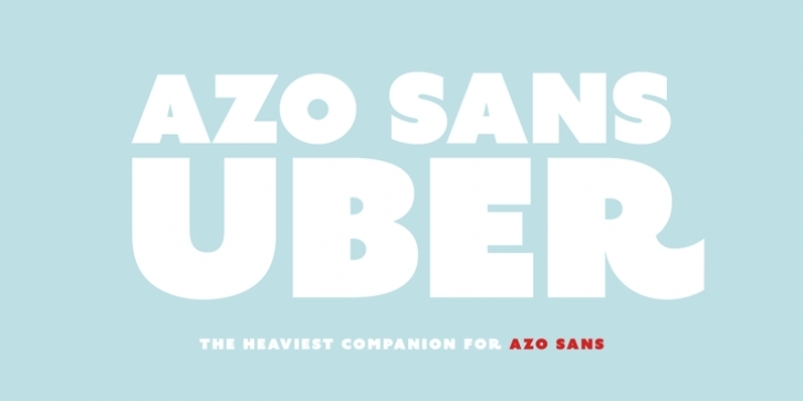
Azo Sans Uber is the heavy headline version of Azo Sans. It explores the maximum weight possible in Azo’s uppercases without dismissing their geometrical appearance. Azo Sans Uber has all the optical adjustments present in the original typeface, but they are exaggerated to give it more personality. This caricaturization is combined with a slight shifting of the weight to the top part of the letters.
Azo Sans Uber also comes with flary alternative glyphs that can be used both automatically as contextual alternates or simply as stylistic alternates.

