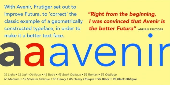
Avenir was designed by Adrian Frutiger and released by Linotype-Hell AG in 1988. The design is based on two earlier sans serif typefaces, Erbar and Futura. Avenir is unusual in that it has weights that are similar, but each is designed for a different purpose.
For example, the Light and Book weights are similar, but Book is most appropriate for text blocks while the Light is better for adding a contrasting element (perhaps a heading) to a heavier weight. These weight selections also allow for optimal results under varied printing conditions.
Use the bold and extra bold weights of Avenir for emphasis with the light, book, and medium weights.

