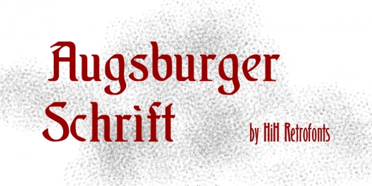
Augsburger Schrift & Augsburger Initialen are among the many fine typefaces that shown in what is perhaps the key typographical reference source for the Art Nouveau period: Ludwig Petzendorfer’s TREASURY OF AUTHENTIC ART NOUVEAU ALPHABETS, DECORATIVE INITIALS, MONOGRAMS, FRAMES AND ORNAMENTS (Copyright © 1984 Dover Publications, New York).
Both were jointly released in 1901 by Bauer & Co., Stuttgart, Germany and by H. Berthhold AG, Berlin, Germany. The design has been attributed to Peter Schnorr.
The Art Nouveau Movement was ignited in Germany and the Austro-Hungarian Empire by the Munich Secession (Sezession in German) of 1892, followed by the Viennese Secession of 1896. These ‘Secessions’ were groups of artists who, like the Impressionists in Paris, rejected and were rejected by the fine arts establishment.
The movement in Central Europe came to be known as Jugendstil after the Secessionist magazine “Jugend”, first published in Munich in 1896. The noted architect, Peter Behrens, was a leader of the movement in Germany and the designer of Behrens Schrift, released in 1901 by Rudhard’schen Giesserei (later renamed Klingspor).
That same foundry released Eckmann Schrift by Otto Eckmann, designer for Jugend Magazine, and later was to employ a caligrapher who was influenced by these designers, Rudolf Koch.
Judging from its similarity to Behrens, one might conclude that Augsburger was designed and released to compete with Behrens Schrift. In general, Jugendstil is darker, more closed in, than Art Nouveau in Western Europe.
For comparison, examine the use of open space in the design work of the Scottish Architect and Designer, Charles Rennie Mackintosh.

