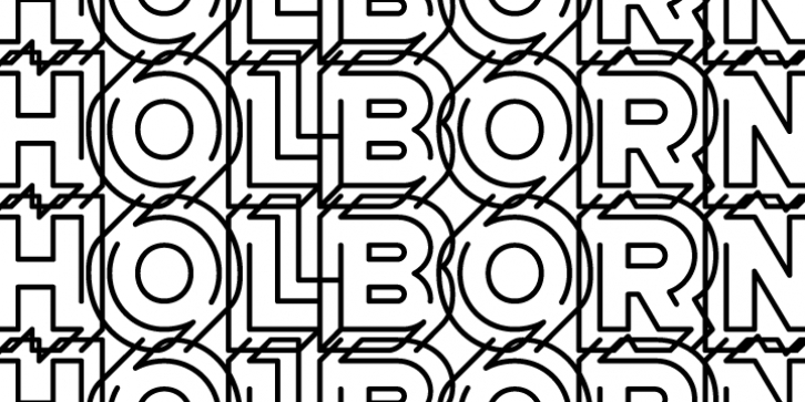
AT Move Holborn was designed by André Toet, Jasper Nijssen and published by André Toet Design. AT Move Holborn contains 1 style.
HOLBORN Aptly named after ‘High Holborn’, a high-street in London where the Central School of Art & Design was based. A font, just in capitals, based on the original design and the earlier sketches (1976) by André Toet. The strong optical illusion in this alphabet makes it an outstanding typeface. Concept/Art Direction/Design: André Toet © 2017

