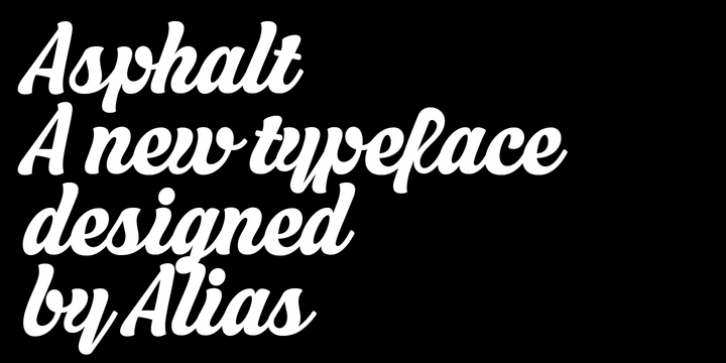
Asphalt was designed by Gareth Hague and published by Alias. Asphalt contains 2 styles and family package options.
Asperity, Asphalt and Aspic, were designed for Another magazine issues 18 and 19, A typeface in three versions, Hard, Soft and Script, three typefaces with the same character shape, where hard is angular, Soft is brushlike, and Script a painted-ish connected design.
For Asphalt, Aspic’s brushy forms are connected into an expressive, striking script typeface. It has a feeling of having been painted by a sign writer, with a brush dipped in too much paint as it has a gloopy, fluid but still readable, quality. Signwriting is seemingly a dying craft, but as with other crafts outmoded by technology or the needs of speed and cheapness of delivery, it is highly revered. At its best it is hugely skilful, quirky, idiosyncratic and expressive. It can occasionally be naive and amateurish, but that’s good too. In a retail environment of familiar brands, any opportunity for individual expression should be cherished.

