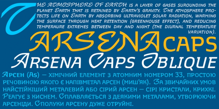
Arsena was designed by Viktor Kharyk and published by Apostrof. Arsena contains 4 styles and family package options.
The font Arsena was designed for a contest on the creation of modern Ukrainian business font ‘Arsenal’ and awarded the 3rd prize.
A little squared figure which is enlightened from the middle, unobvious, but the existing modular grid, simplified, but not a primitive design of letters, mathematically defined optimum inclination angle, counterbalanced ratio of thickness, an optimum spacing and a manual kerning – all of this is for the best reproduction in any conditions as well as for the maximum clarity and readability.
Asymmetric slab serifs make the font Ukrainian and at the same time have a modern and dynamic look.
Besides its highlighting function, Italics also have an independent assignment. The Italics are made under calligraphic traditions in a modern style of mono-thickness (but optically compensated) and in particular, in combination with alternative initials of the same style and it is relevant to use it in a private letter, or in the design of the official greetings, etc. It is also promoted by four typographic ornamental motives.
Due to the above-mentioned qualities this font can be used successfully for a wide range of tasks – from business to mass media, publishing, advertising and accidental.

