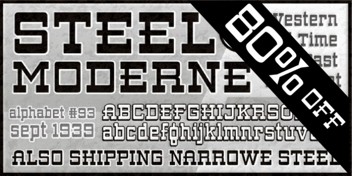
ARB 93 Steel Moderne was designed by Alf Becker, Michael Adkins and published by The Fontry. ARB 93 Steel Moderne contains 32 styles and family package options.
Want an authentic Western font? From way back when? For an old-timey feel? Heck, pardner, those ain’t big old slab serifs yer lookin’ at. Those are ‘bars’, as in bars of steel. They might be a little rusty, though, having been around since 1939. That’s when these branding-iron ready letterforms first graced the pages of ST Publications’ SIGNS of the Times magazine. This was the 93rd type treatment by master sign painter, Alf R. Becker. And while he had hoped the sign guys would soften things up a bit by blunting the edges of all that steel, most have been left sharp and cut-ready. So watch your fingers! And watch also for the Narrowe version of Moderne Steel. It’s been pre-condensed to avoid those embarrassing stretch marks that result from an improperly distorted layout. And of course we did go ahead and blunt the edges a bit, so you wouldn’t hurt yourself. That’s why this one Becker font family maxes out at 32 flavors. That’s a lot of bolding and blunting and italicizing going on there!
Beginning in January, 1932, Alf R. Becker of St. Louis Missouri, at the request of then-editor E. Thomas Kelly, supplied ‘SIGNS of the Times’ magazine’s new Art and Design section with an alphabet a month, a project initially predicted to last only two years. Misjudging the popularity of the ‘series,’ it instead ran for 27 years, ending finally two months before Becker’s death in 1959, for a grand total of 320 alphabets, a nearly perfect, uninterrupted run. In late 1941, just ten years after the first alphabet was published, 100 of those alphabets were compiled and published in book form under the title, 100 Alphabets, by Alf R. Becker.
As published in September, 1939, this is the description that accompanied Becker’s 93rd alphabet, Steel Moderne:
Steel Moderne is Alf R. Becker’s ninety-third alphabet in his almost-8-year-old series of alphabet art in SIGNS of the Times. This style can be used effectively in all lines of modern sign work. Top and bottom bars are extra heavy, with vertical lines half the thickness of the bars, and all edges are blunt.
Many font designers have tackled converting Becker’s incredible achievement from paper to digital, and many claim to treat his work with care and dignity. But the Fontry’s Becker fonts remain the most historically accurate and viable treatments available, arriving in two industry-satisfying versions: CAS (Computer-Aided Signmaking) and DTP (Desktop Publishing). And as with all Fontry fonts, the kerning is not optional–it’s exceptional-!!!

