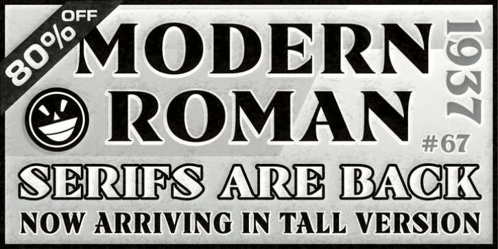
ARB 67 Modern Roman was designed by Alf Becker, Michael Adkins and published by The Fontry. ARB 67 Modern Roman contains 16 styles and family package options.
Hunting for a Roman font with serious serifs and vintage shapes usually turns up some pretty typical and yawn-worthy results. Unfortunately, one Roman serif tends to look like another. And then you find yourself staring at this font, a headliner face that takes its job (and serifs) very serious. But stare too long and you’ll find yourself looking at lines and curves that aren’t all that familiar. What is happening? Are we still in the new millenium? Of course we are–but this font isn’t. It thinks its still 1937, and SIGNS of the Times magazine by ST Publications has just released it as the 67th alphabet by master sign painter, Alf R. Becker. But vint as it is, this face has been fighting the font wars since 1999, and as of 2009, it has a companion now for those ongoing battles. Bolstered by a tall simulacra of its standard, wider self, ARB 67 finally stands ready to engage all of those empty headlines and banners and signboards that just cry out begging for a font like this.
Beginning in January, 1932, Alf R. Becker of St. Louis Missouri, at the request of then-editor E. Thomas Kelly, supplied SIGNS of the Times magazine’s new Art and Design section with an alphabet a month, a project initially predicted to last only two years. Misjudging the popularity of the ‘series,’ it instead ran for 27 years, ending finally two months before Becker’s death in 1959, for a grand total of 320 alphabets, a nearly perfect, uninterrupted run. In late 1941, just ten years after the first alphabet was published, 100 of them were compiled and published in book form under the title, ‘100 Alphabets,’ by Alf R. Becker.
As published in July 1937, this is the description that accompanied Becker’s 67th alphabet, Modern Roman thick-and-Thin:
Modern Roman Thick-and-thin, Alf R. Becker’s sixty-seventh alphabet in his SIGNS of the Times series, is an attractive, easy-to-read headline letterform, similar in some respects to Spurred Egyptian Thick-and-Thin.
Many font designers have tackled converting Becker’s incredible achievement from paper to digital, and many claim to treat his work with care and dignity. But the Fontry’s Becker fonts remain the most historically accurate and viable treatments available, arriving in two industry-satisfying versions: CAS (Computer-Aided Signmaking) and DTP (Desktop Publishing). And as with all Fontry fonts, the kerning is not optional–it’s exceptional-!!!

