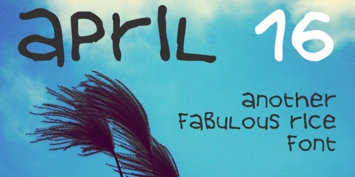
April 16 is a deconstructed, hand-written lowercase font that was designed one gloomy day of April. Its purpose it to tell a message in a legible way, yet with a real contempt for standard-looking, everyday fonts. It will work the best with a short message, a title of a few words or a logo, and will remain easy to read in most situations.

