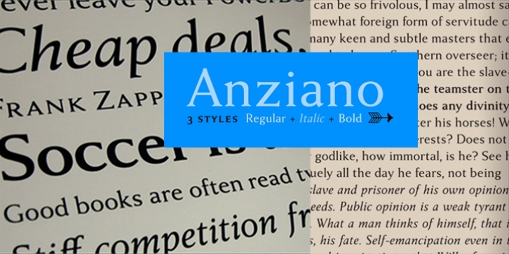
Diving deeper into the art of making legible and strong text faces, Stefan Hattenbach has become aware of the importance of attention to detail. He has found it equally important to leave a distinct personal touch in the design of such typefaces. Ultimately, typefaces for books and magazines should be low key. They should deliver the message of the text and not stand out too much. This might be the biggest challenge of all.
Anziano follows the same direction that he staked out with his popular Delicato family. When creating a traditional typeface, you will be inevitably influenced by earlier designs. Anziano shows touches of Weiss (Emil Rudolf Weiss, 1926) – another classic book typeface. Stefan had appreciated the design of Weiss for a long time. At least he appreciated the roman weights – the italics always felt a bit off to him.
In 2004, he purchased a first edition of the Swedish version of The Lord of the Rings (1959-1961) and was amazed by the excellent flow and presentation of the text on each page. He realized that several major foundries had already done interpretations of Weiss – all of which were more or less true to the original. He didn’t want to add to that list. Instead, Stefan has tried to find his own path with Anziano and hopefully people will think that the design lives on its own.

